Redesigning a compaNy logo
Network Sheffield
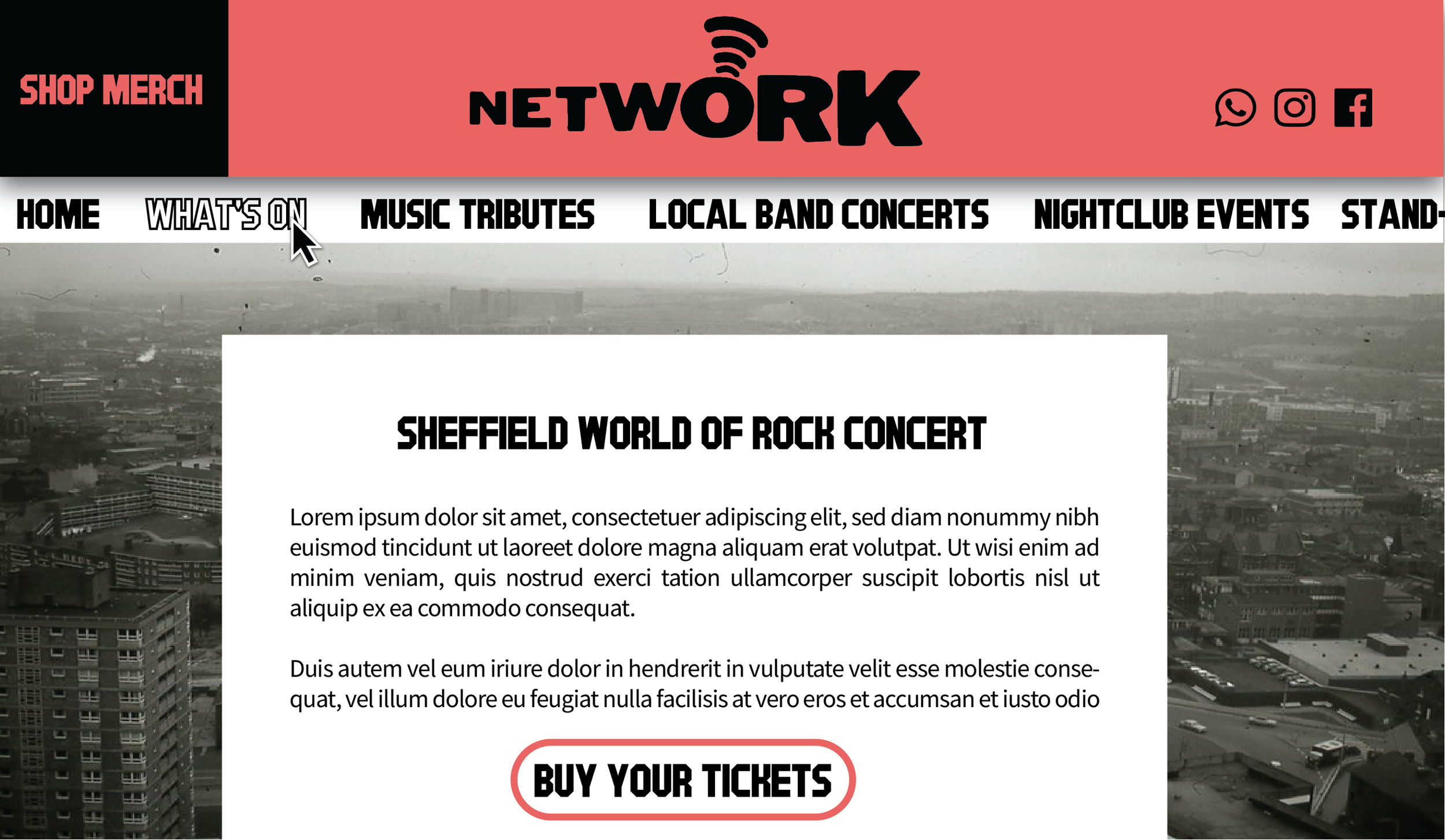
I created a new website design, shown below, using Canva after finding it more intuitive than Adobe Express. As you can see, I have introduced a dedicated area of the website to the sale of merch. Network doesn’t currently sell any merch online. After seeing merch successfully sold as an additional revenue source for venues such as The Leadmill, I felt this was a missed opportunity that they could capitalise on.
Events are separated into categories to make finding something of interest to you much easier and faster, a calendar of events can be accessed from a page called ‘what’s on’ and the website is more engaging through the use of colour, in this case a dark pink (symbolising urgency and passion).
Network is an actual company based in Sheffield. I wanted to test my logo-making ability by designing a new logo and website. I began by researching everything I could about the company and the history of Sheffield, before sketching down some initial ideas in my notebook. Finally, I drew out versions of my favourite design in Illustrator and created what you see above.
This logo visually represents the connotations of the name ‘Network’. The letters increase in scale to suggest an increase in popularity and fanbase. Likewise, a ripple-effect symbol above the letter o is used to the same effect. Equally, this symbol helps customers remember the company name, being almost identical to the widespread symbol for wifi networks and connectivity. I chose to build on these specific connotations to capitalise on Network’s promotion of local, emerging artists - something that sets it apart from its rivals. The logo is black to represent the deep industrial roots of Sheffield, once a significant location in the manufacture of steel.


