Designing a new brand
Pet Shed
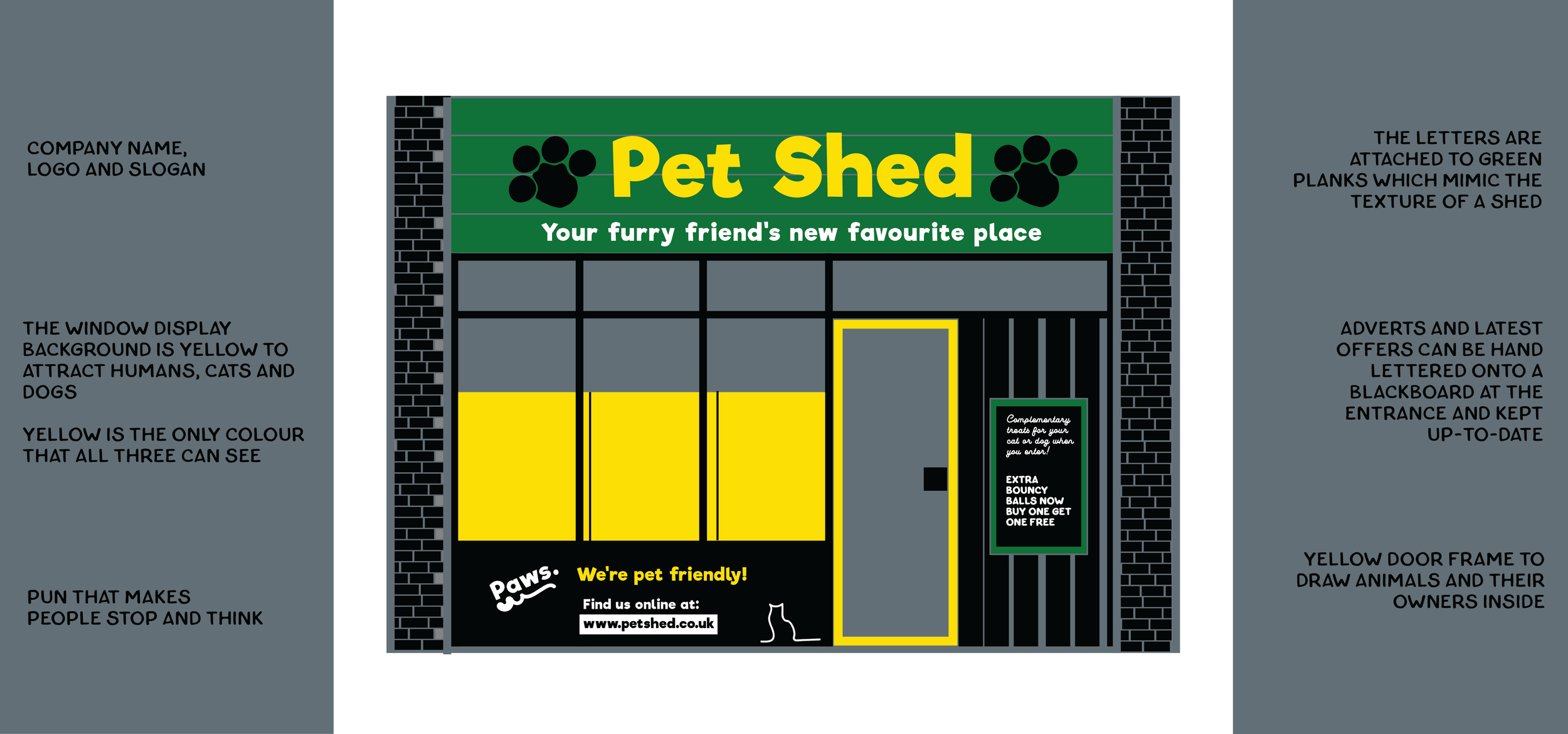
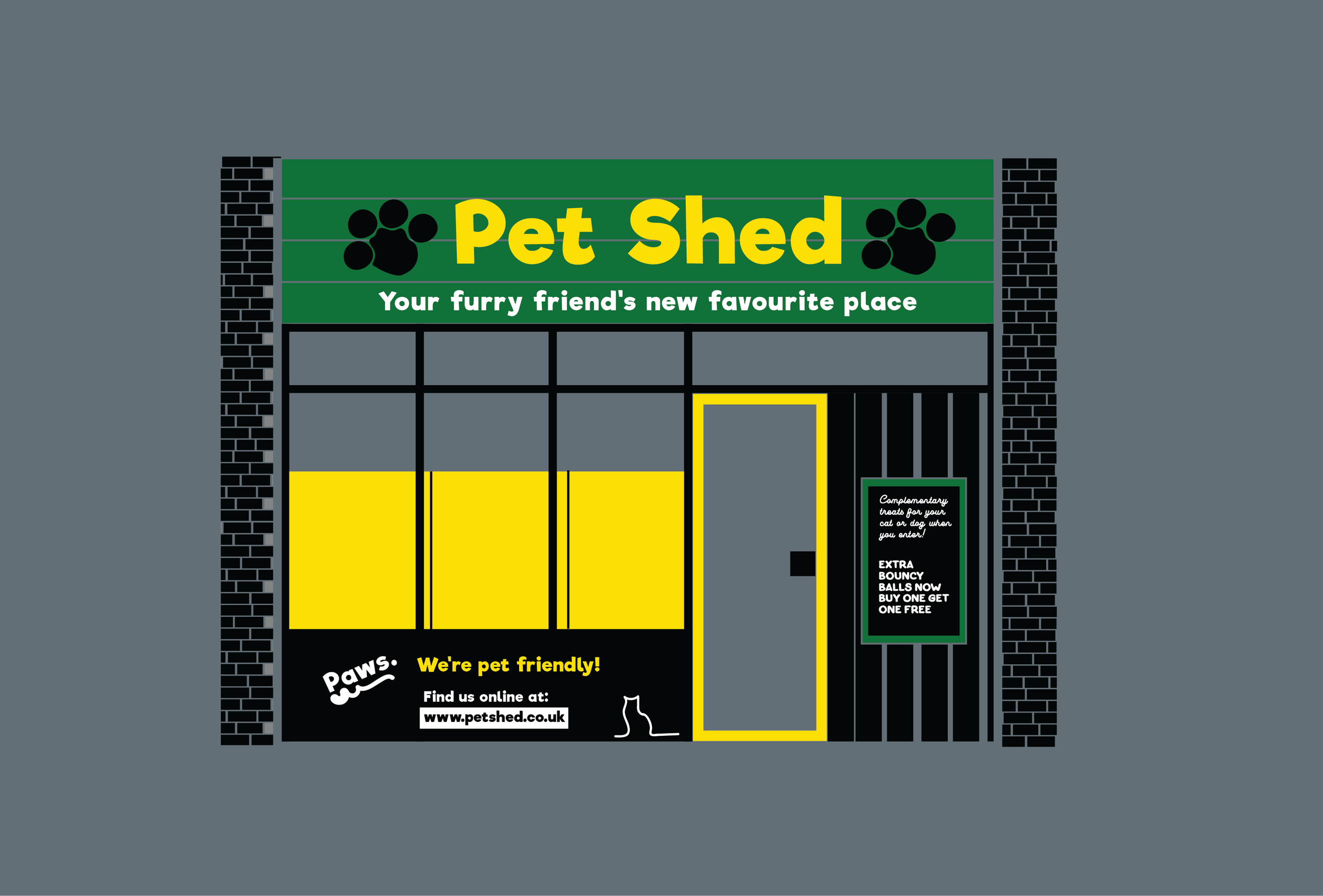
Successful pet supply stores are those that have worked hard to understand their customers. Brands like Pets at Home and Butternut Box successfully use type, colour and language to deliver a service that feels warm, fun and personal. To create a similar feeling, Pet Shed uses a bright, friendly colour scheme and a rounded, fun typeface. The colour green symbolises trust whilst also suggesting the products are eco-friendly and natural. The brightness of the shop’s colours also helps to draw attention and make Pet Shed memorable.
Above, an illustration of a shopfront for an imaginary shop called Pet Shed. I set myself the challenge of designing a new and unique pet care brand. The final designs that you can see above and below were arrived at after extensive research.
To stand out against its competitors, Pet Shed uses the colour yellow. Yellow is one of the few colours that dogs, cats and humans can see, so strategically using yellow for the shopfront signage, around the door and behind the treats and toys on display in the shop window will help to draw cats and dogs inside. To my knowledge, no existing brand has tried this before!
Furthermore, a hand-lettered blackboard at the entrance offers all animals accompanying their humans a treat on entry, making Pet Shed’s target market not just animal owners but the pets themselves.